Table of Contents | ||||
 |
 |
 |
 |
 |
| ||||
Table of Page Contents | ||||
| Fraktur Introduction | Berks County, Pennsylvania | Details about Certificate Paper | More Details about Certificates | Finale |
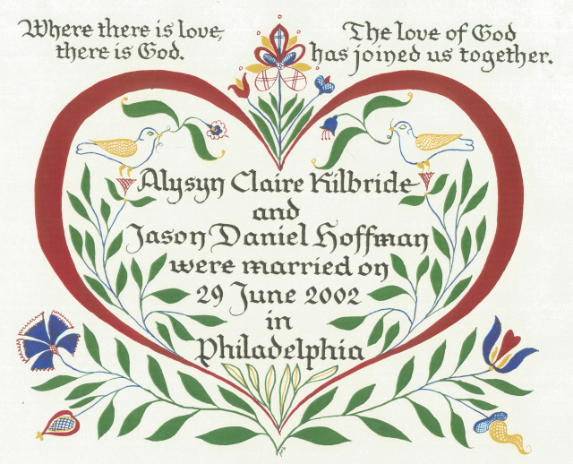
Fraktur IntroductionThe term “Fraktur” translates from the German as broken, which describes the type of lettering Gutenberg copied when he first set up a moveable type printer. Protestant immigrants who came to America in the mid-1700s brought their traditions of marking major stages of life with handmade certificates. In time the style became known as Pennsylvania Dutch although the roots were specifically German and some succeeding generations relocated to other states and Canada. | ||||
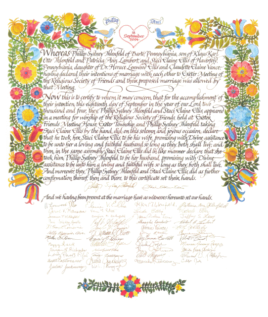
Berks County, PennsylvaniaThe certificate above was created for a couple that admires and has collected Fraktur documents in Berks County, Pennsylvania. The design and flowers within the decoration are similar to historical references, and the color scheme also follows the tradition. Although the fraktur lettering style is used at the very top within the decoration, it was deemed too difficult to read for the body of the certificate. Therefore the vows are written by hand in italic lettering with a metal nib using Sumi ink. The decoration was applied with watercolor using both a pen and brushes. | ||||
Details about Certificate PaperThese certificates were written on a full sheet of Arches Hot Pressed watercolour paper. A full sheet measures 22 inches wide by 30 inches long and includes two watermarks in opposing corners. Hot pressed refers to the finish the paper is given at the end of its production, where heated rollers give the paper a firm and smooth surface. In contrast, cold press paper is also run through rollers, but unheated, leaving a less smooth surface with texture. Cold pressed paper works well with a brush whereas hot press paper holds up well for pen and ink. | ||||
 | ||||
More Details about CertificatesPam has tried many different brands and types of ink over the past twenty-five years. Some inks contain shellac, which makes them appear shiny, and are also notorious for corroding metal nibs. Some inks have a bluish or brownish tinge to them, which is particularly apparent when they’re diluted. Yasutomo, a Japanese company makes the KY6 sumi ink that Pam uses most often. This sumi ink has a very deep blackness to it, rather like the fine stick inks which require manual preparation to be used. The KY6 sumi comes in an opaque plastic bottle, requiring the user to fill the ink well of choice for use. Pam most often uses tiny plastic vials that come with lids and sit in a wooden holder. | ||||

This is an actual Fraktur Certificate that follows the tradition of the Germans' customs. | ||||
FinalePam is pleased to share her samples of Quaker marriage certificates. Customers often find her through a classified ad that runs in each month in the Friend’s Journal. Occasionally requests come in for weddings only a week or two away, but Pam mostly appreciates the prospective customers who provide more than six weeks for completion of their certificate. Customers have come through from all states on the east coast and once from Britain, but usually they range from Virginia to New York. | ||||
Go back to the top of this page.Sincerely, Pam Calligraphy & Design © 2009 Pamela R. Bennett | ||||
